Raising the Bar on Inclusion in Post-Production
INDUSTRY STANDARD
CASE STUDY
↓
↓

Raising the Bar on Inclusion in Post-Production
Elevating Industry Standard’s brand was a multidimensional challenge, blending art direction with strategic thinking to create an impactful presence that could meaningfully connect with an underserved creative community. Our approach was rooted in the belief that every visual and interaction should reinforce Industry Standard’s mission to transform the post-production landscape.
01 Crafting a Resonant Visual Identity

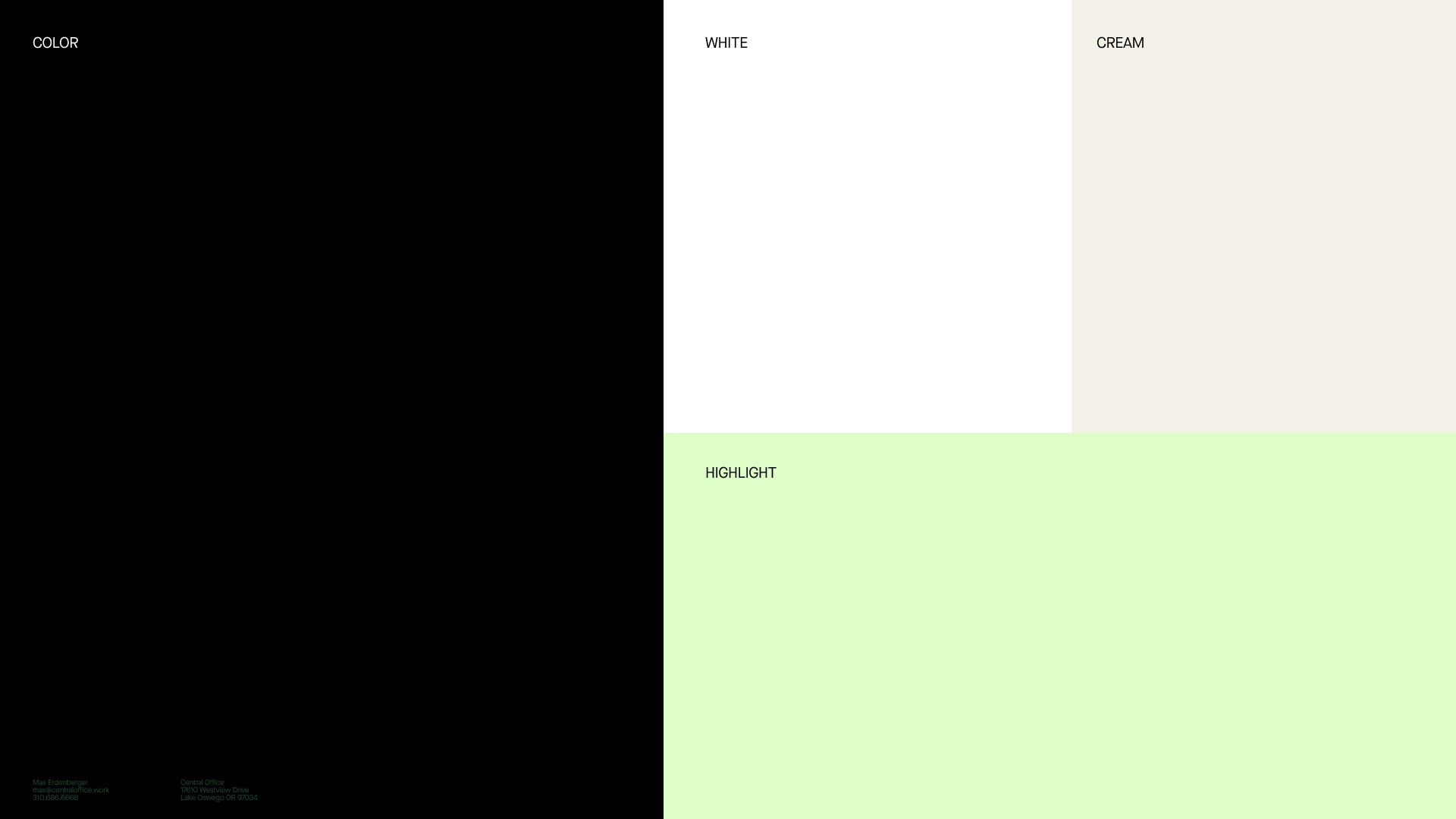


02 Managing Color Theory
Color has the power to evoke emotions and actions. By understanding color psychology, art directors can manipulate hues and tones to create desired outcomes. For instance, blue instills trust, while red triggers excitement. Be consistent with your color choices across all mediums. A unified color scheme creates a recognizable brand identity and lends professionalism to the project.
Colour possesses the ability to stir emotions and provoke responses. Gaining knowledge of colour psychology enables creative directors to expertly handle shades and tints, producing intended results.
For example, trust is associated with blue, while red incites enthusiasm. Maintain uniformity in your colour selections across diverse platforms. A cohesive colour palette helps establish an unmistakable brand image and imparts a sense of professionalism to the undertaking.
03 Typography and Readability
Typography is the voice of your design. Fonts should be in harmony with the overall design, but also legible and readable across various platforms and sizes.
Pay attention to the line-height, kerning, and letter-spacing. Good spacing enhances readability and aesthetic appeal. Well-chosen and well-spaced typography can elevate your design from good to great, providing both aesthetic and functional benefits.
Typefaces must harmonize with the overall layout while also ensuring legibility and readability on diverse platforms and dimensions. Consider line-height, kerning, and letter-spacing carefully.
Effective spacing augments both readability and visual allure. Thoughtfully selected and well-spaced typography can propel your design from merely good to outstanding, offering both aesthetic and practical advantages.
SHARE ARTICLE